Packaging
Packaging design from dieline to shelf: retail boxes, pouches, labels and shipping packaging built to carry the brand, explain the product and survive production — every project starts from the technical dieline and ends in real-world mockups.
Splash Muse
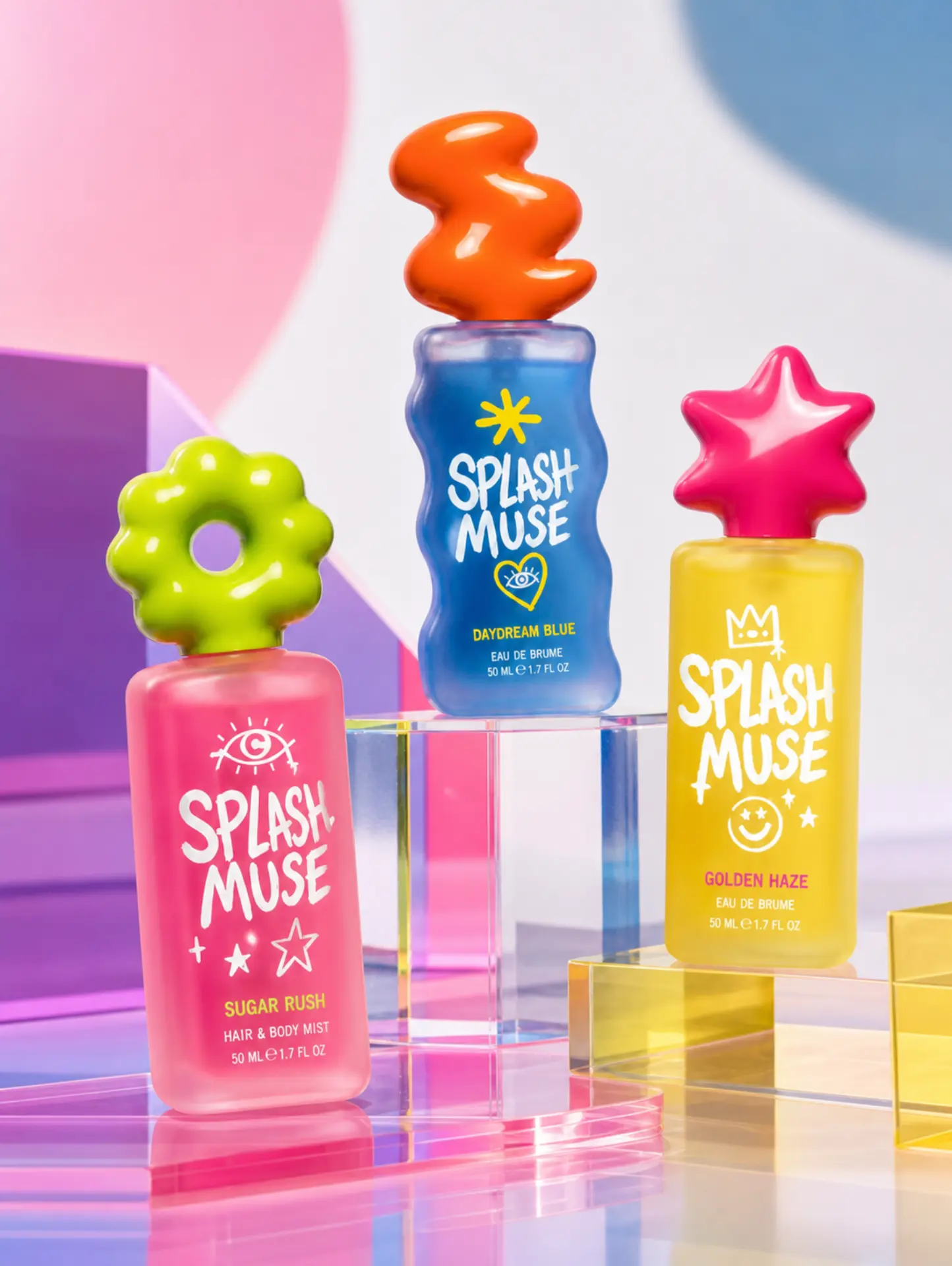
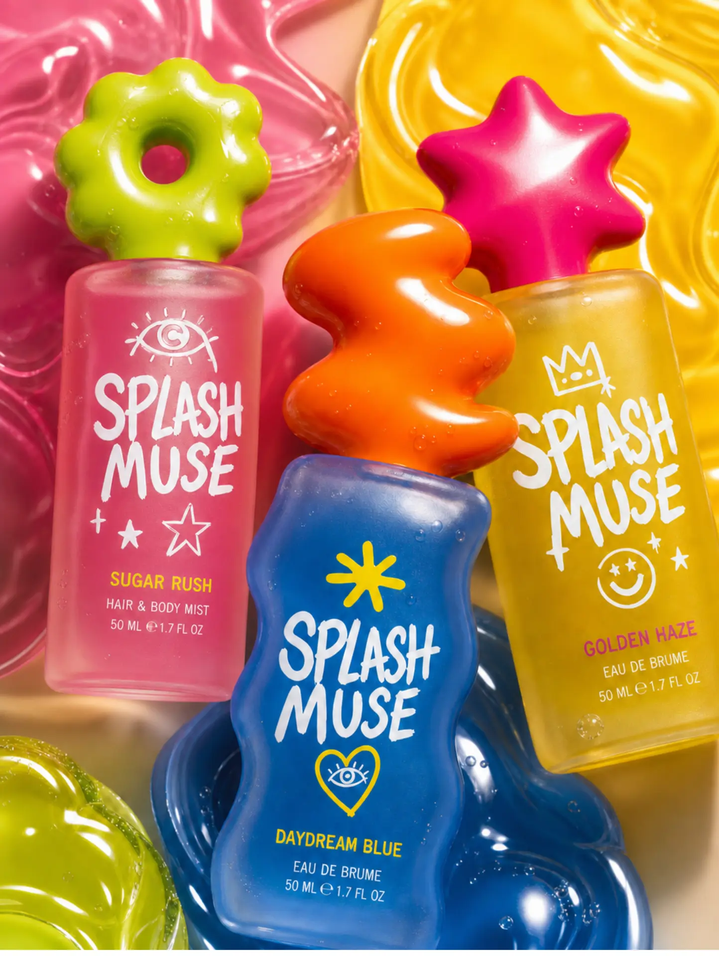
A concept project: a hair and body mist line created from scratch for girls between 14 and 17 — the age when a fragrance stops being a product and becomes a way of introducing yourself. The work covered the full ideation: brand name, personality, fragrance naming, packaging design, dielines and the campaign imagery used to launch it. Brand manifesto: we are not a quiet kind of pretty. We are the loudest laugh in the room, the sticker on the mirror, the song played twice. Sugar Rush is the sweet, giggly rush of a good day. Golden Haze is late afternoon light and the confidence that comes with it. Daydream Blue is the drifting, imaginative side that dreams bigger than the room it's in. Three moods, one girl, all of them true at once. Bright frosted glass, oversized flower, star and squiggle caps and hand-drawn eyes, crowns and smileys turn each bottle into something collectible — a toy on the shelf and a signature on the skin.
The Collection
Three 50 ml mists built as a family: Sugar Rush in candy pink, Golden Haze in warm yellow and Daydream Blue in deep blue. Each one keeps the same frosted body and hand-painted logotype and changes only the sculptural cap and the doodle icon, so the trio reads as one line while every fragrance keeps its own personality.
All Café
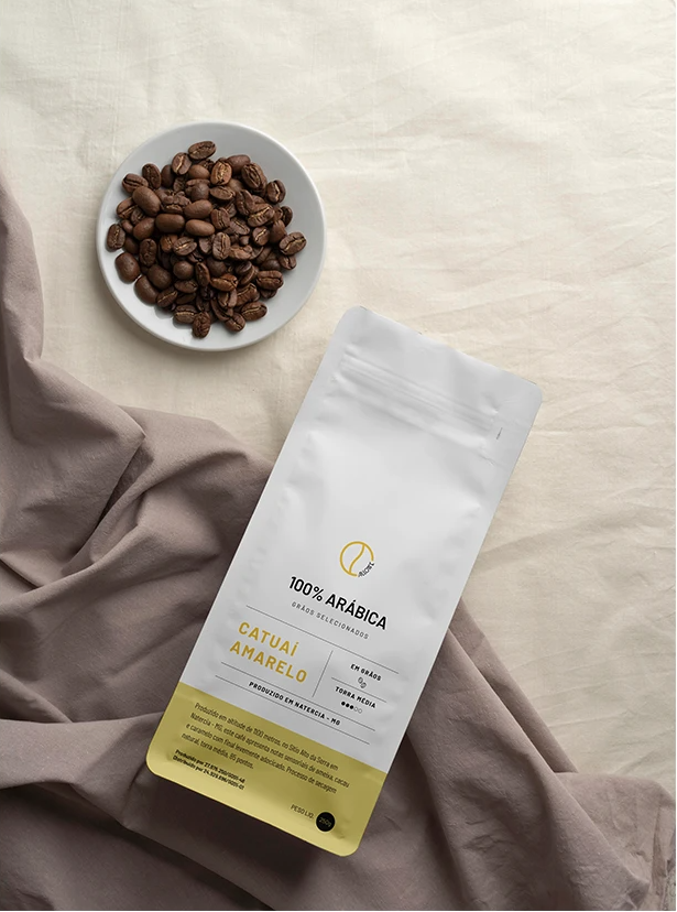
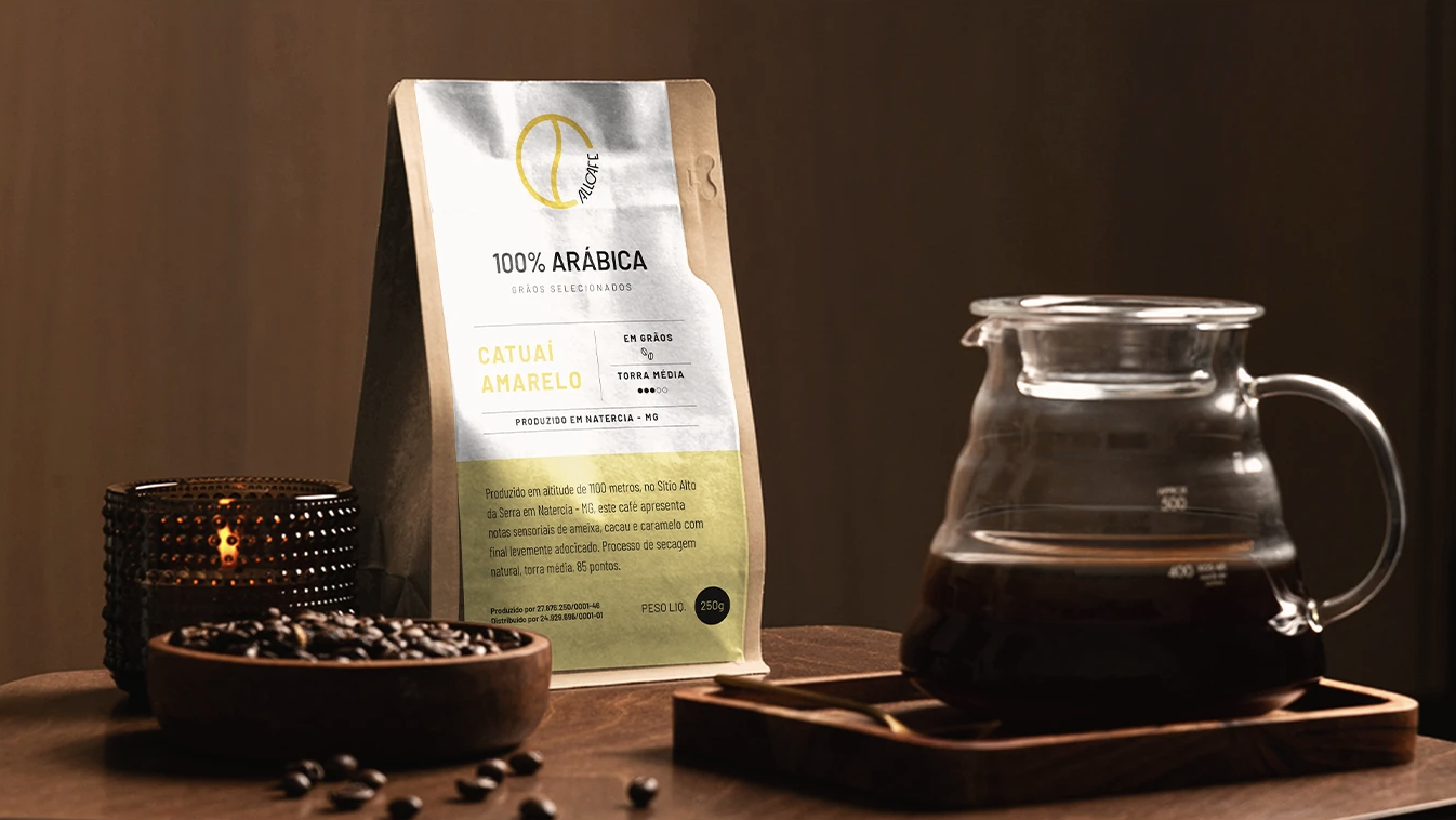
A specialty coffee from Natércia, Minas Gerais, produced at 1,100 meters. The label system was designed to flex across roast profiles: a clean white label with the gold All Café monogram, the variety name in large type and a yellow footer carrying origin, altitude and sensory notes.
Styled Mockups
Lifestyle shots that test how the pack behaves on the shelf and at the brew bar, surrounded by beans, fabric and brewed coffee.
Volkertech
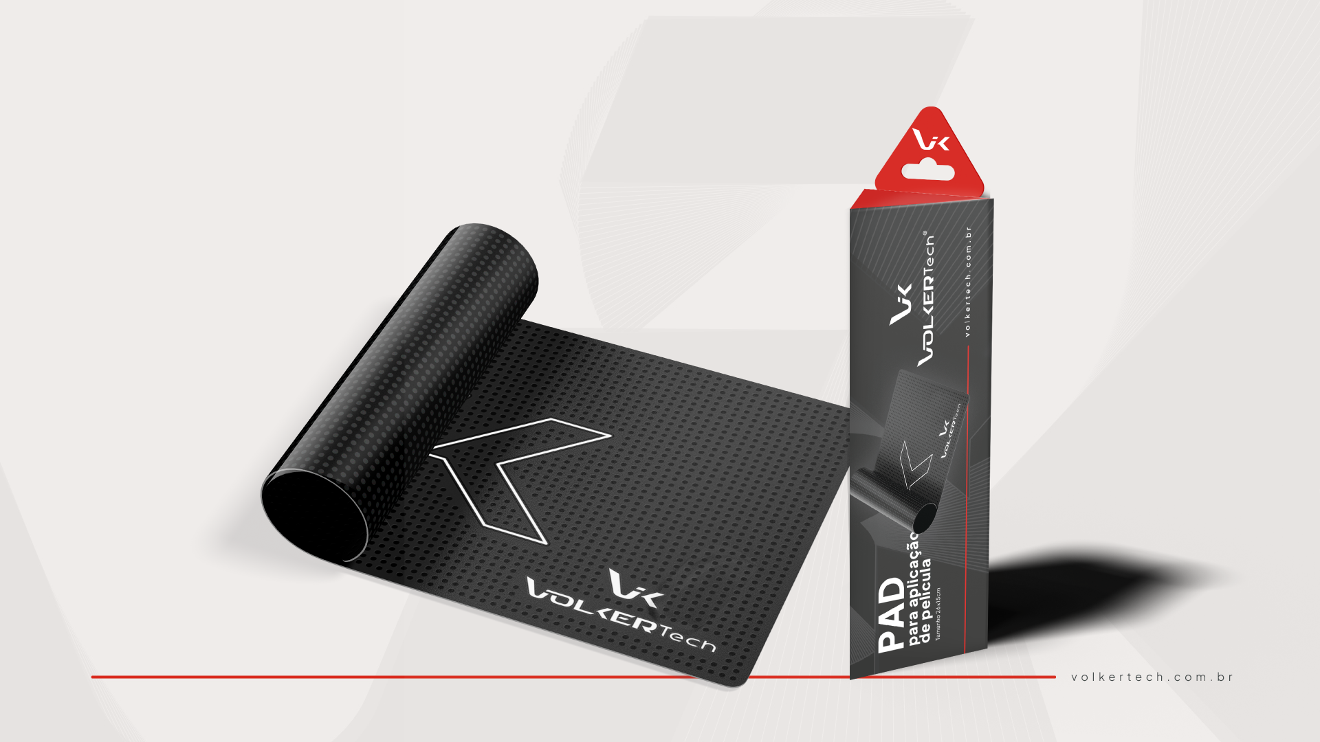
A Brazilian mobile accessories brand. The packaging system pairs a dark technical grid with the brand's red accent, keeping the VK monogram large on every face so the line reads as one family across pads, screen protector kits and shipping boxes.
Application Pad
A textured rubber pad used to apply screen protectors, sold in its own triangular-top hanging box. The packaging mirrors the product: the dotted grip texture of the pad continues across the box surface, with the red hang tab carrying the VK monogram at the top.