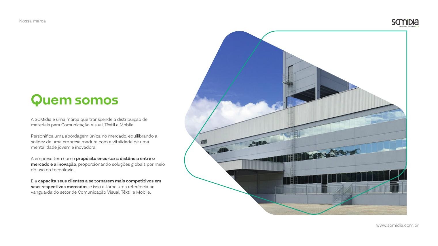
Who They Are
SC Mídia is more than a distributor of materials for Visual Communication, Textile and Mobile markets. The company embodies a distinctive approach: the solidity of a mature business combined with the energy of a young, innovation-driven mindset.
Its purpose is to shorten the distance between the market and innovation, delivering global solutions through technology. By doing so, it makes its clients genuinely more competitive in their own markets, which is what places SC Mídia at the forefront of its sector.
Positioning, Purpose & Mission
The positioning statement moves the brand away from being seen as a supplier and towards being read as a promise of innovation, reliability and competitiveness. It is the choice for companies looking for global, technologically advanced solutions.
Purpose: to shorten the distance between the market and innovation. Mission: to amplify the results of the Brazilian market through global solutions, sustained by a healthy work environment that keeps people committed to reaching shared goals.
These two statements were written first because everything else in the manual, from tone of voice to color, had to be a consequence of them rather than a decoration on top.
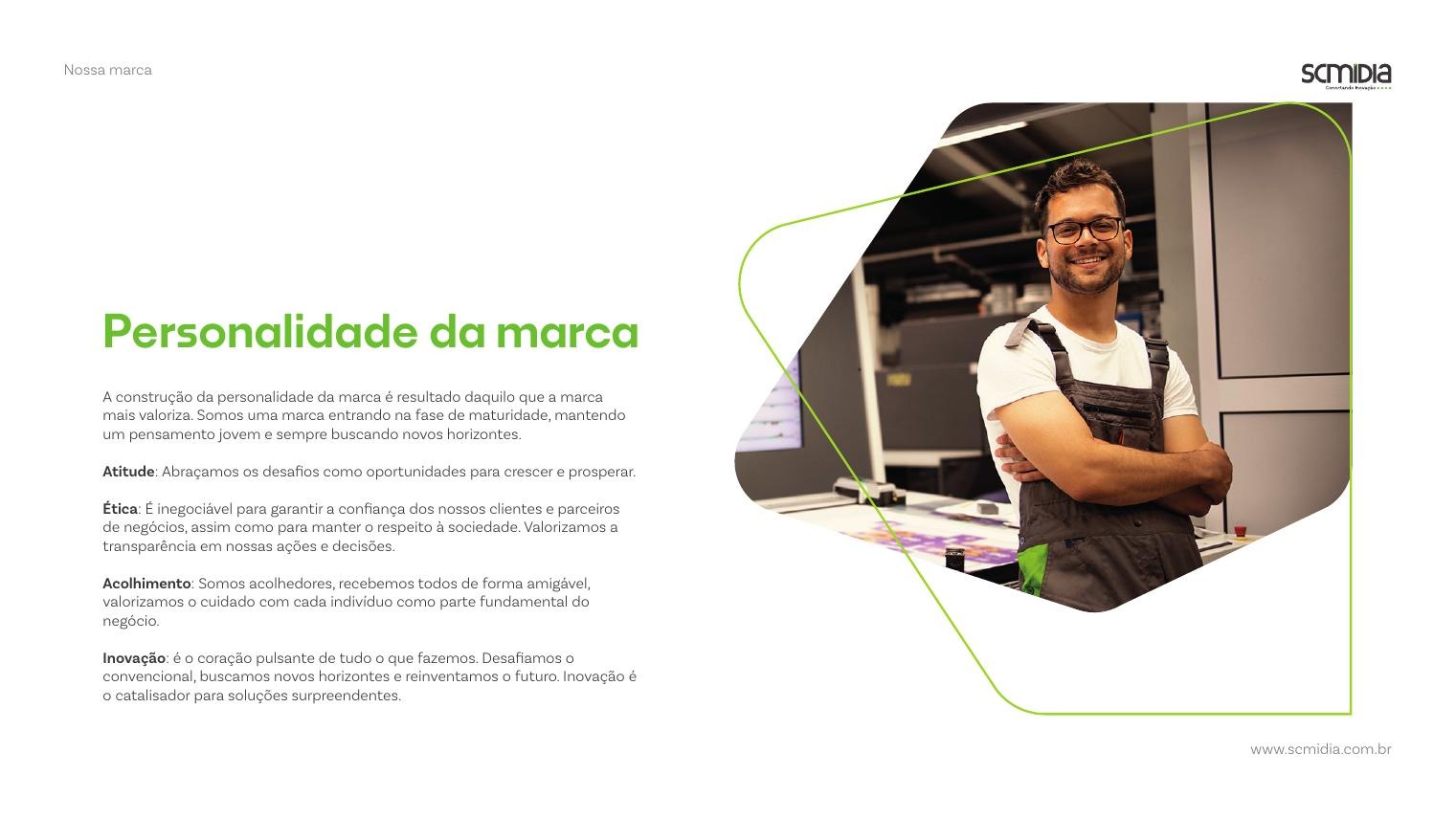
Brand Personality
A personality study defined how the brand should behave before defining how it should look. SC Mídia was framed as a brand entering maturity while keeping a young mindset, always looking for new horizons.
Four traits were fixed as non-negotiable. Attitude: challenges are treated as opportunities to grow. Ethics: transparency in actions and decisions, as the base of trust with clients, partners and society. Warmth: everyone is received in a friendly way, with care for the individual as part of the business. Innovation: the beating heart of the operation, challenging the conventional to reinvent what comes next.
Language & Tone of Voice
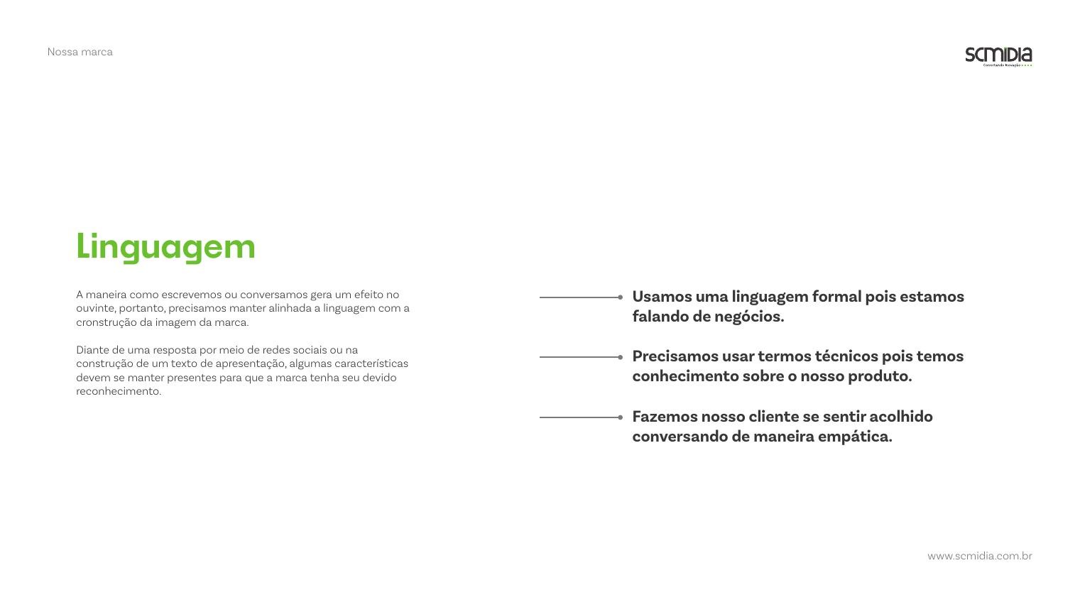
The way the brand writes and speaks shapes how it is perceived, so the manual sets language rules for social replies, presentations and commercial texts alike.
The tone stays formal, because the conversation is about business. Technical vocabulary is welcome, because the team genuinely knows its products. And empathy is mandatory: every exchange should leave the client feeling welcomed rather than processed.
Logo & Application Variations
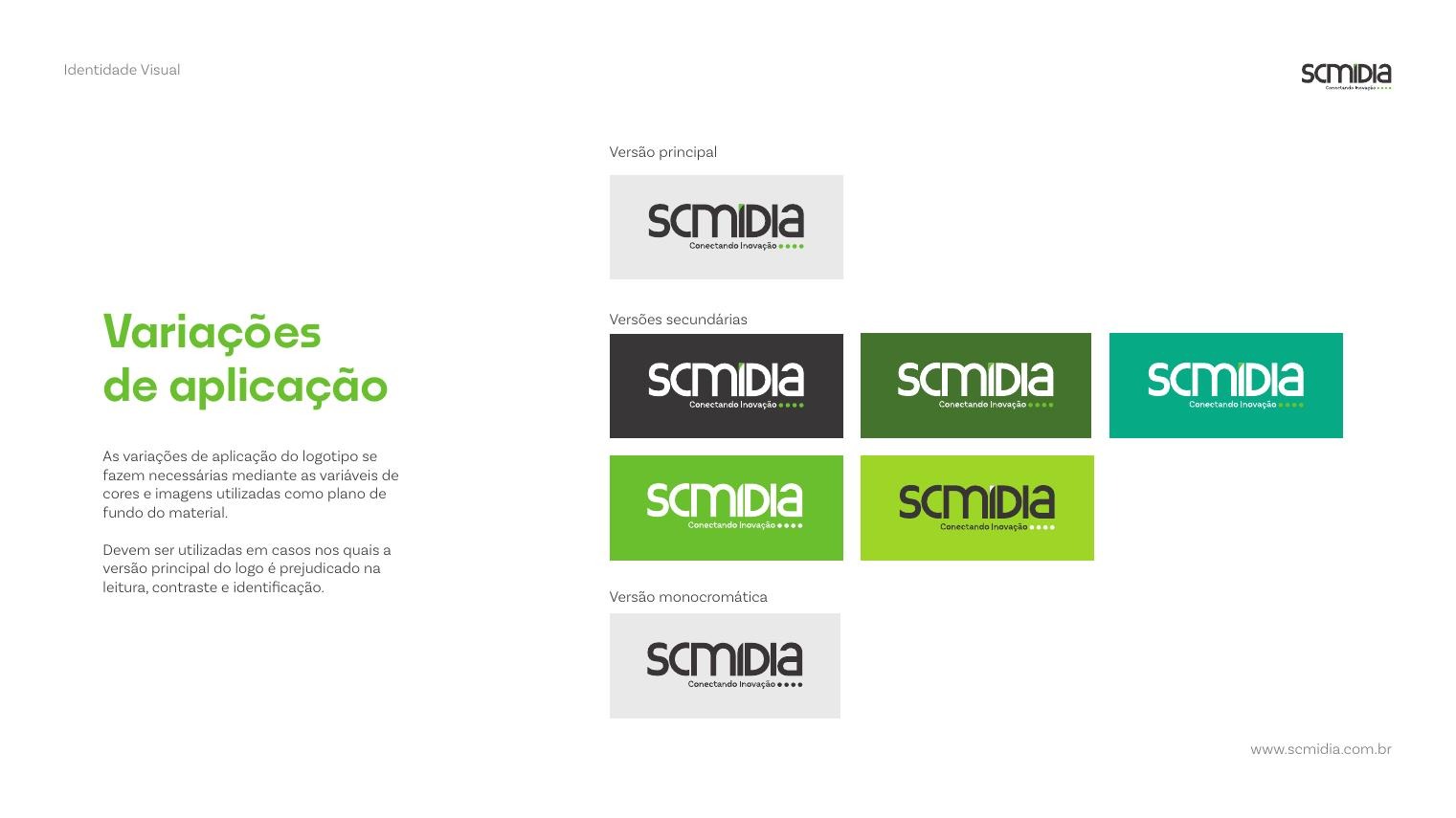
The logotype is the graphic signature that distinguishes the brand in its market, so its use is regulated in detail. The primary version pairs the logotype with the 'Conectando Inovação' tagline and is the default in every piece.
Secondary and monochrome versions exist for a practical reason: backgrounds change. Whenever color or photography compromises legibility, contrast or recognition of the primary lockup, an approved variation takes over instead of an improvised fix.
Color Palette
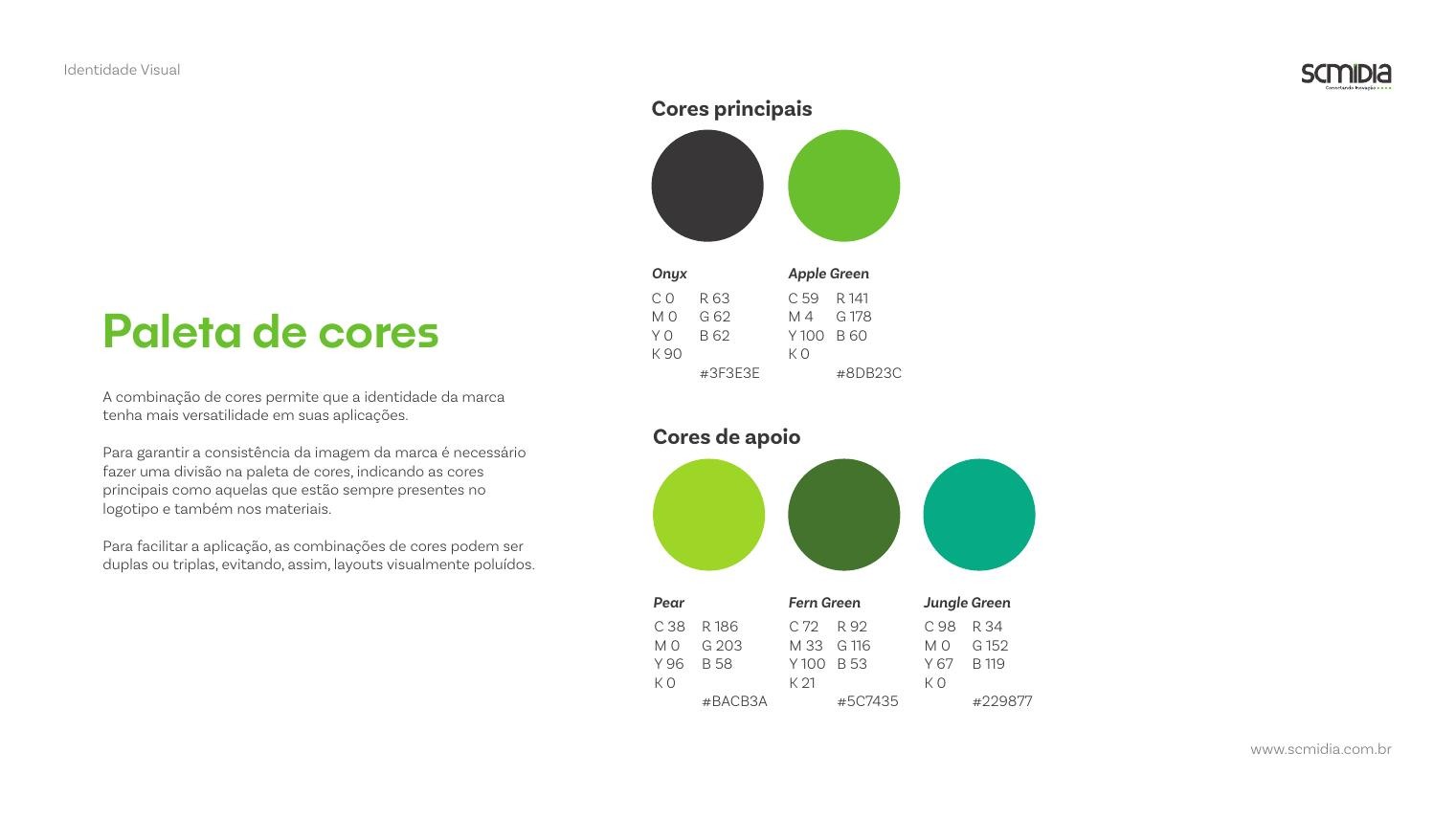
The palette is split into primary and support colors so the identity can flex across applications without losing consistency. Onyx (#3F3E3E) gives the brand its industrial, grounded base, while Apple Green (#8DB23C) carries the energy and the technological, forward-looking side of the positioning.
The support range extends that idea: Pear (#BACB3A) brings brightness for highlights, Fern Green (#5C7435) adds depth and seriousness, and Jungle Green (#229877) introduces a cooler, more technical note. Together they let the same identity feel either corporate or vibrant depending on the piece.
To keep layouts clean, combinations are limited to pairs or trios, and every combination must include at least one of the primary colors.
Typography
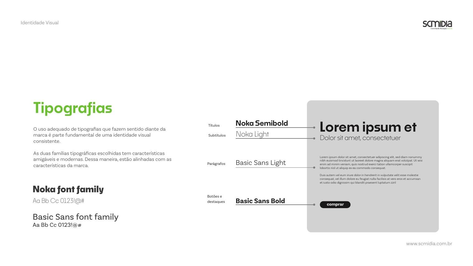
Two type families were selected for their friendly, modern character, matching the brand personality. Noka handles headlines in Semibold and subheads in Light, giving titles a geometric, contemporary structure.
Basic Sans covers body copy in Light for long, comfortable reading, with Bold reserved for buttons and highlights. The pairing keeps technical information legible while the headlines carry the brand's confident tone.
Graphic Elements
The graphic elements are generated systematically from a construction grid, which produces a wide family of shapes usable as backgrounds, image crops and supports for text.
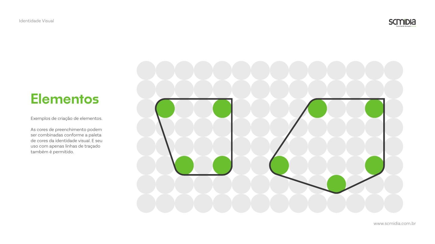
Three rules govern every shape: one corner must keep two lines meeting at 90 degrees; all other corners are rounded using the grid base radius; and the 90-degree corner never touches the page edge, always respecting the layout margin. Shapes can be filled with palette colors, combined by overlap, or used as outlines only.
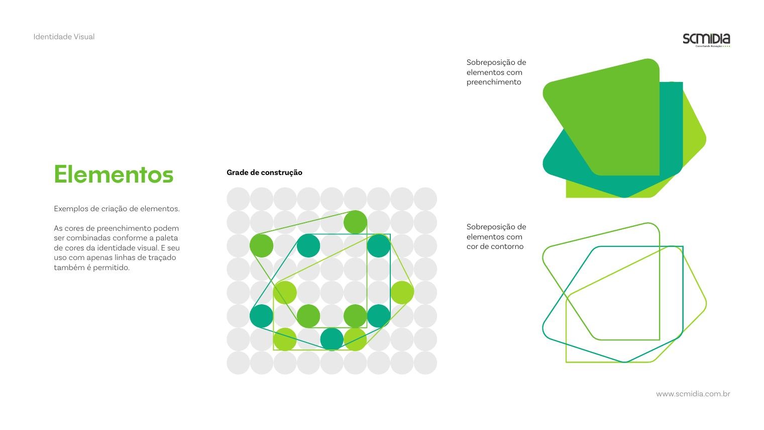
Image Direction
Much of the brand's visual expression comes from photography of products and operations, so the manual sets a consistent treatment. Images favour predominantly warm tones and deliberately highlight the primary brand colors on the main objects in frame.
People appear young-looking, happy and determined, with a purposeful posture toward the task at hand. Classic stock-photo clichés, such as staged celebrations, pointing gestures or exaggerated facial expressions, are explicitly avoided.

Brand Applications
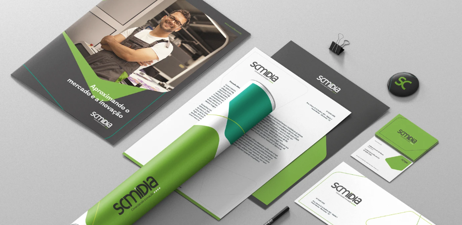
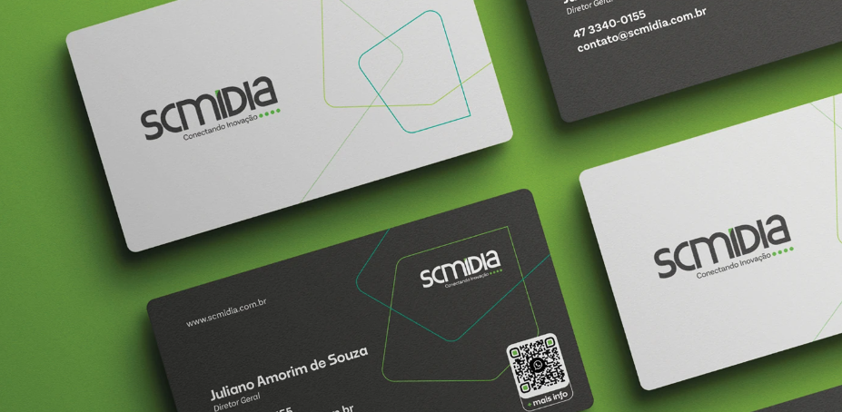
With the system defined, it was applied to the material the sales team actually carries into a meeting: a presentation folder built around the 'shortening the distance between the market and innovation' message, letterhead, a document tube, a lapel button and business cards in both light and dark versions.
The cards show how flexible the element system is. The outlined shapes work as a discreet graphic signature on white stock, while the onyx version lets the green lines glow, keeping the same identity in two very different moods.
E-commerce & Shipping
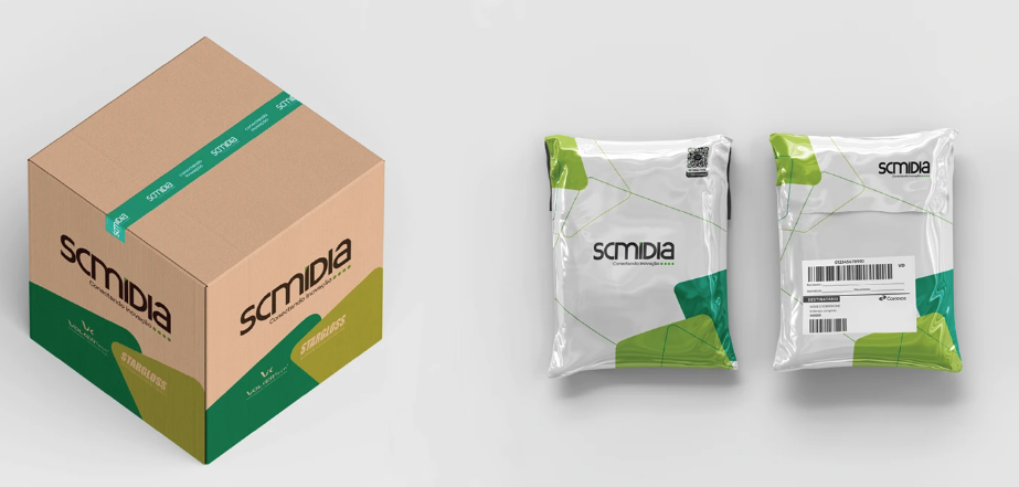
For the e-commerce operation, the identity had to survive kraft cardboard and plastic mailers. Shipping boxes use bands of Fern Green and Pear so the package reads as SC Mídia before anyone gets close, with the logo repeated on the branded tape.
The mailer bags apply the graphic elements as corner crops, leaving clear areas for the shipping label and codes. It is the most functional application in the system and the one that reaches the client most often.
Stationery
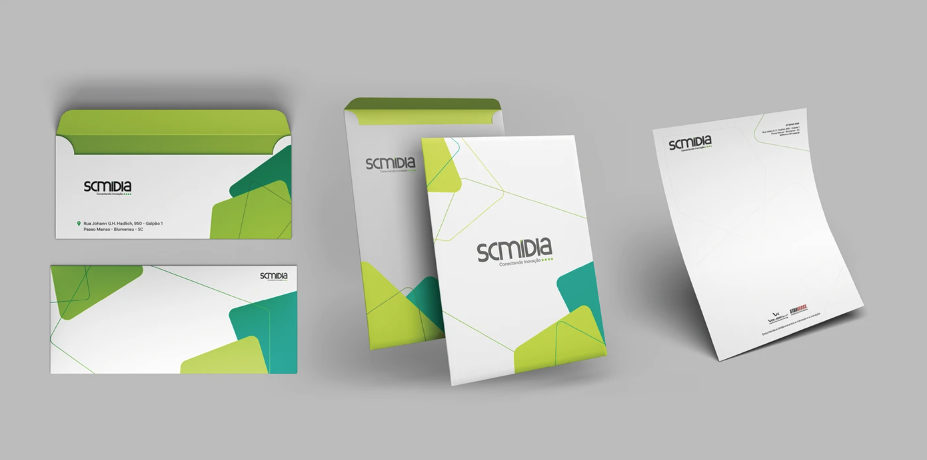
The stationery set extends the same rules to envelopes and letterhead: green inner linings, filled element shapes as corner accents and a strictly consistent placement of the logo.
Event Stand
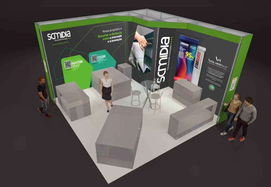
SC Mídia takes part in trade shows, so the identity was scaled up to an exhibition environment. The stand walls carry the purpose statement in large type, the element shapes structure the product panels, and QR codes turn each wall into an entry point to the catalogue.
At this scale the palette does most of the work: onyx walls hold the space together while Apple Green marks the areas meant to attract and guide visitors.
Internal & Digital
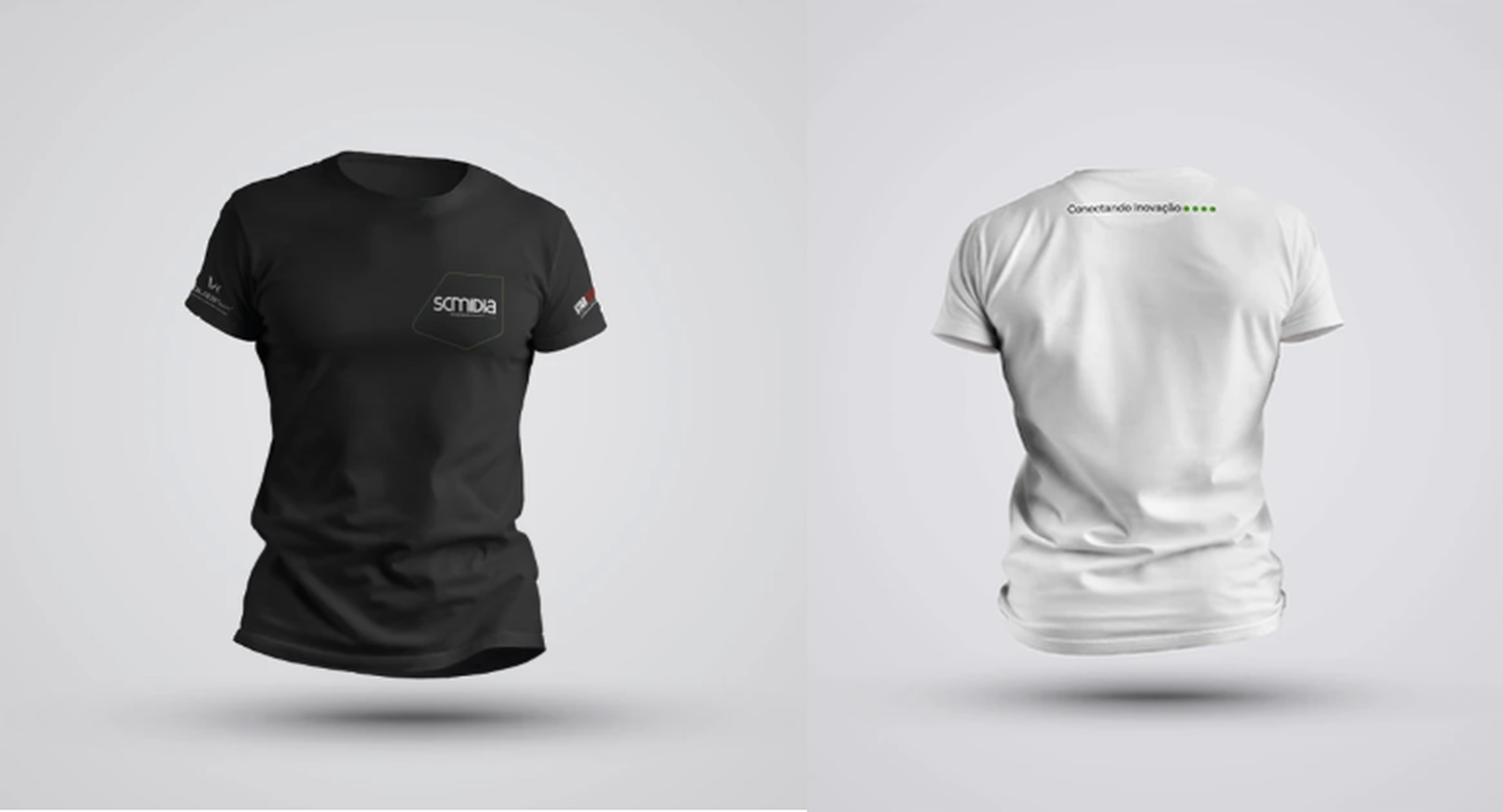
Internally, the brand shows up in the team's daily routine: uniforms in black and white with the logo and tagline embroidered small, so the person stays in the foreground and the brand stays present without shouting.
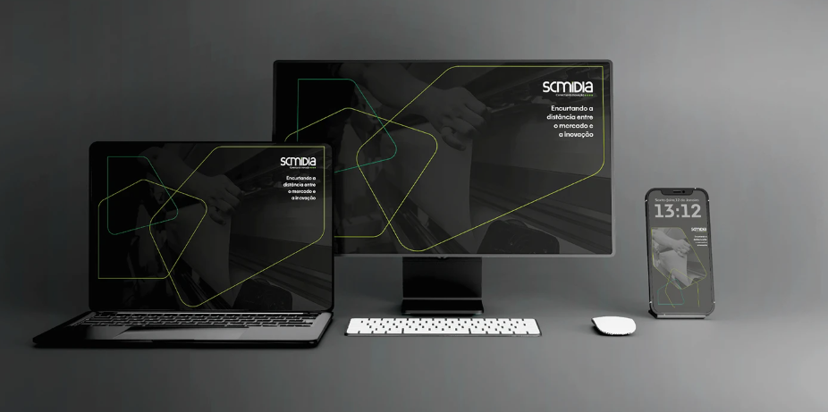
The digital set closes the system with desktop, monitor and mobile wallpapers built from the element outlines over darkened operation photography, repeating the same purpose line the whole identity was designed around.
Outcome
The manual gives SC Mídia a coherent system that scales from a social post to a trade show wall: a defined positioning, a regulated logo, a split palette, two type families, a generative element system, a clear photographic direction and a full set of applications from sales material to shipping and uniforms.