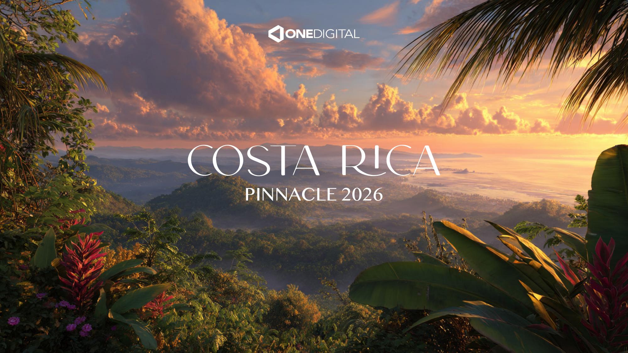
The Brief
One Digital needed a visual identity for Pinnacle 2026, an incentive trip designed to reward and inspire its team in Costa Rica. The request was clear: present three distinct logo suggestions that could capture the spirit of the destination while staying sophisticated enough for a corporate event.
The goal was not to deliver a finished brand manual, but a short, focused book that would give stakeholders a clear vision of three possible directions before one was selected for full development.
Concept & Inspiration
The creative starting point was 'Pura Vida', the Costa Rican way of living that blends gratitude, nature, and a slower, more intentional rhythm. That idea guided the palette, typography, and the choice of native symbols: the toucan, the sloth, and tropical foliage.
Each direction translated the same concept through a different visual language: one bold and iconic, one refined and architectural, and one soft and handcrafted. This gave the client a real range of personalities to choose from.
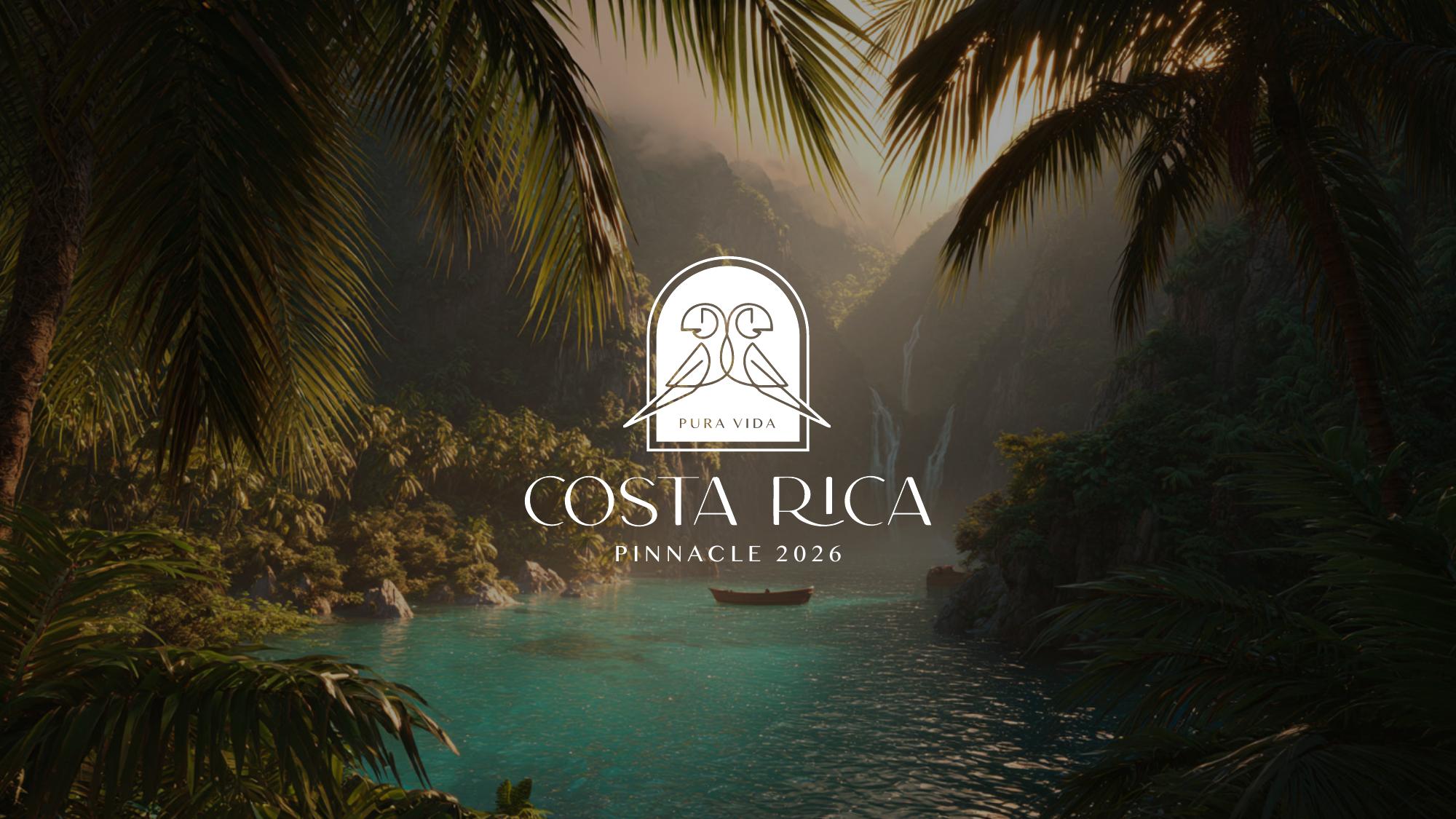
Logo Suggestions
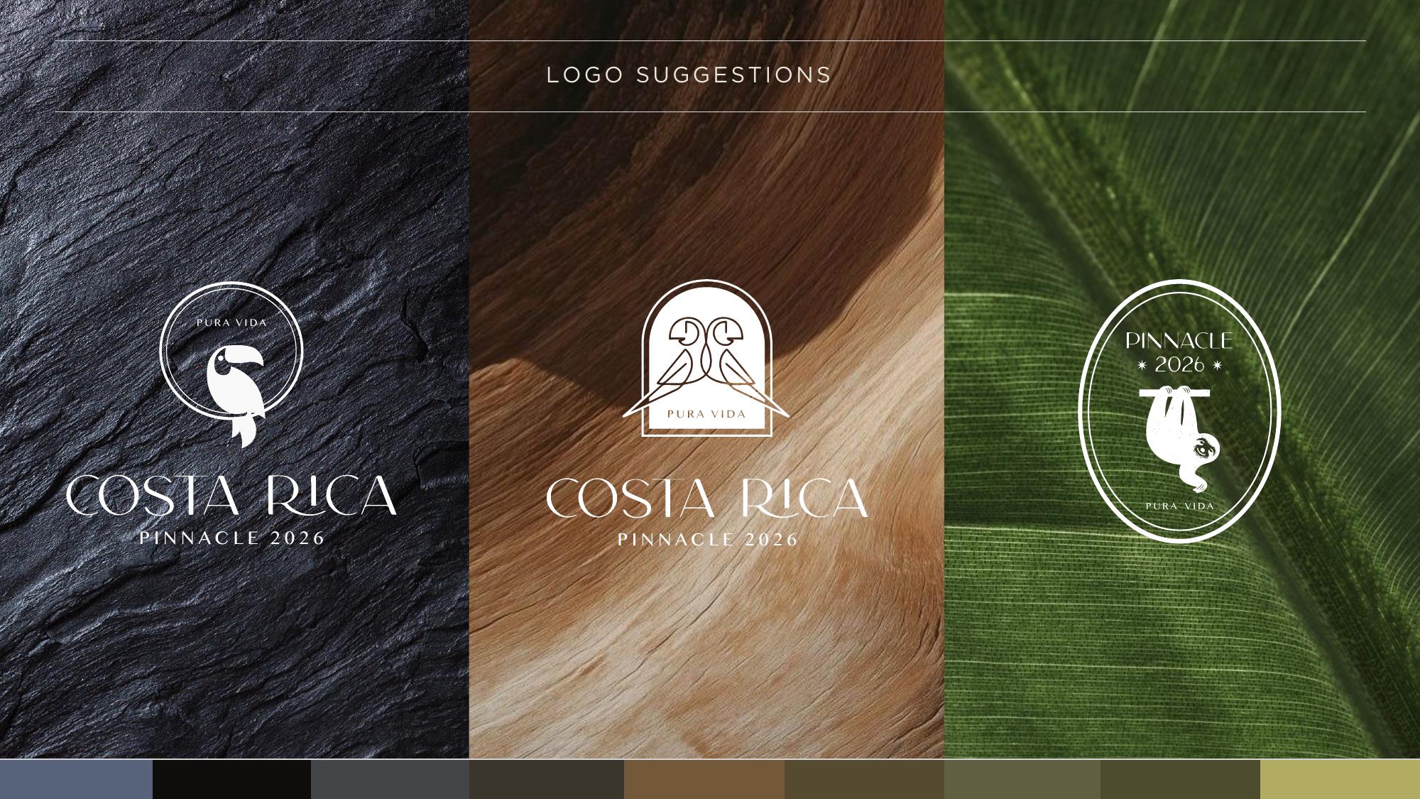
Three logo proposals were developed to explore different ways of representing the trip. Each version paired a native Costa Rican animal with clean typography and a controlled color story, balancing local warmth with the premium feel expected by One Digital.
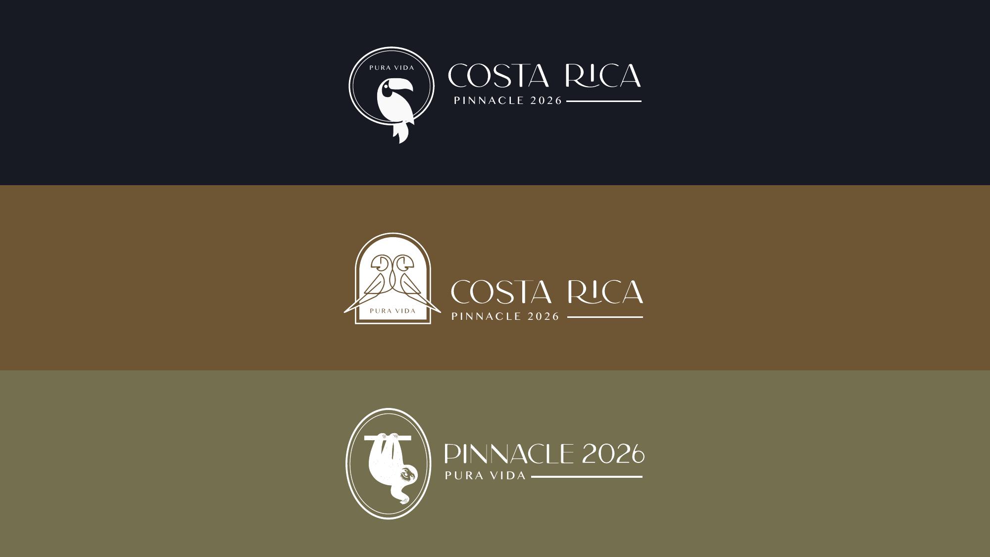
The first direction used a toucan inside a circular seal, the second framed two parrots in an arched badge, and the third placed a sloth inside an oval mark. All three kept 'Pura Vida' and 'Pinnacle 2026' as core textual anchors.
The color story was pulled directly from Costa Rican textures. The rock formations inspired a deep blue and a steady gray; weathered wood became three layered browns; and tropical foliage translated into three natural greens. Keeping the palettes rooted in the landscape made the identity feel authentic rather than decorative.
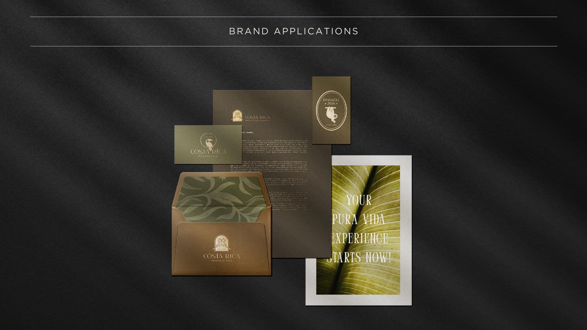
Brand Applications
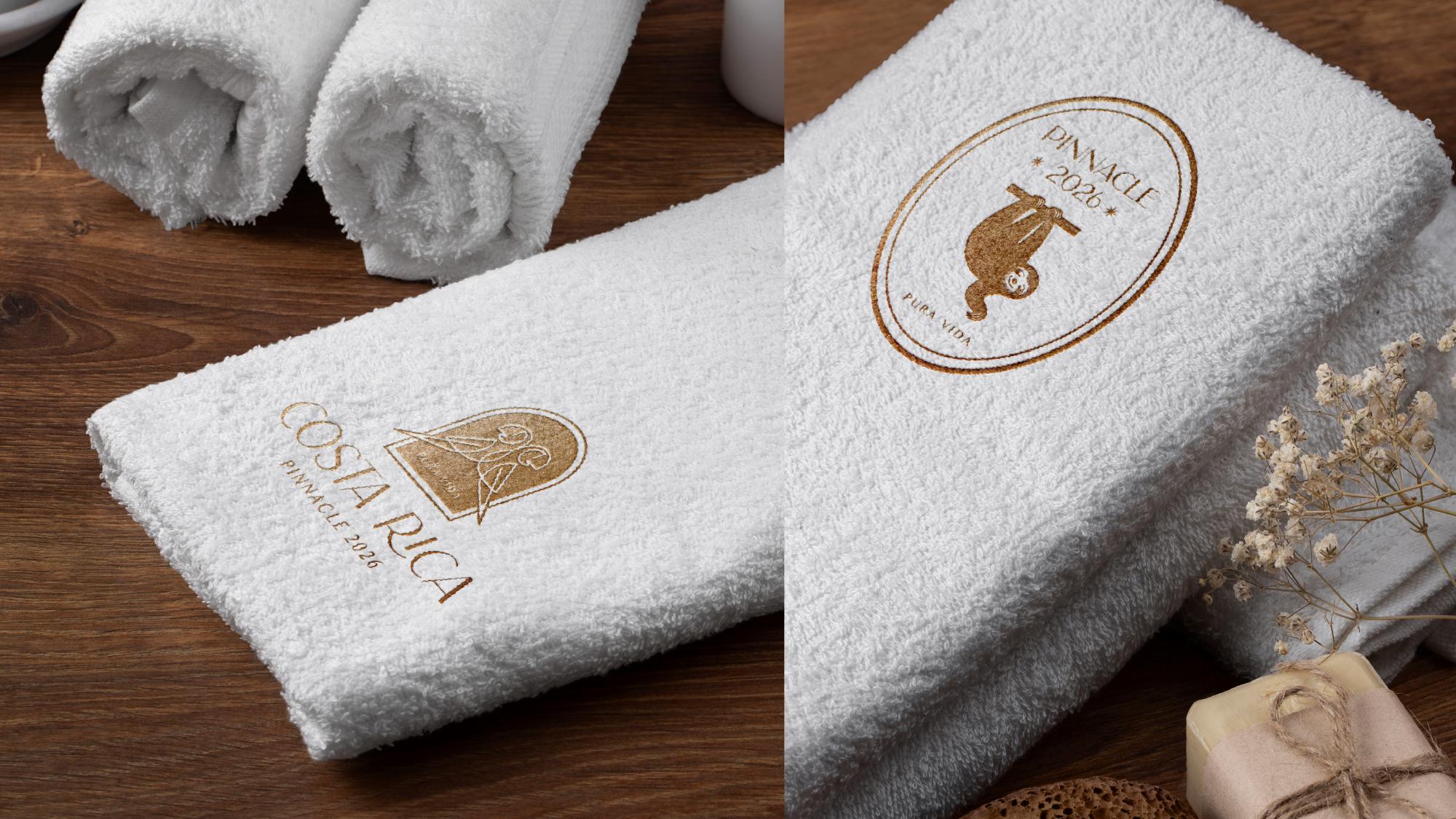
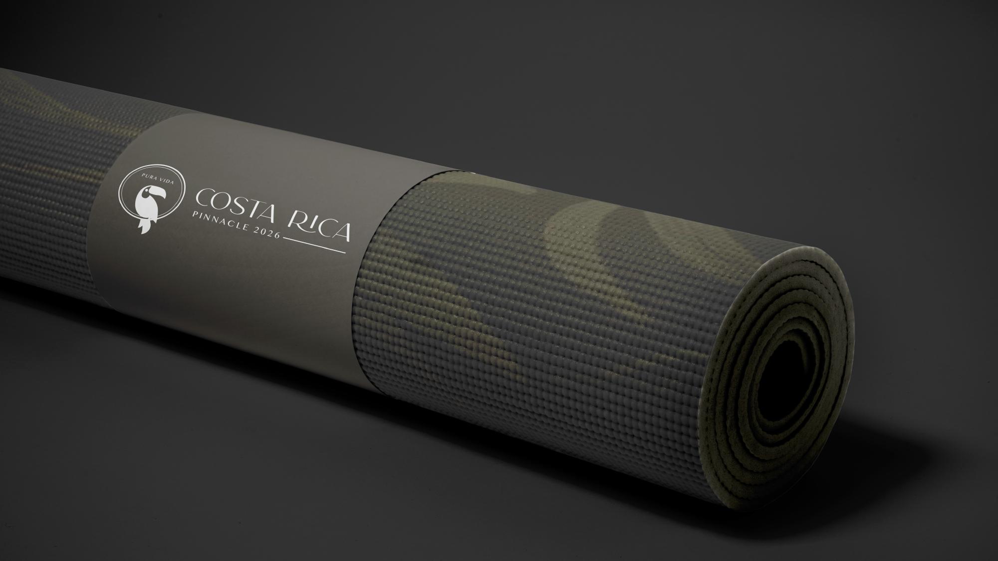
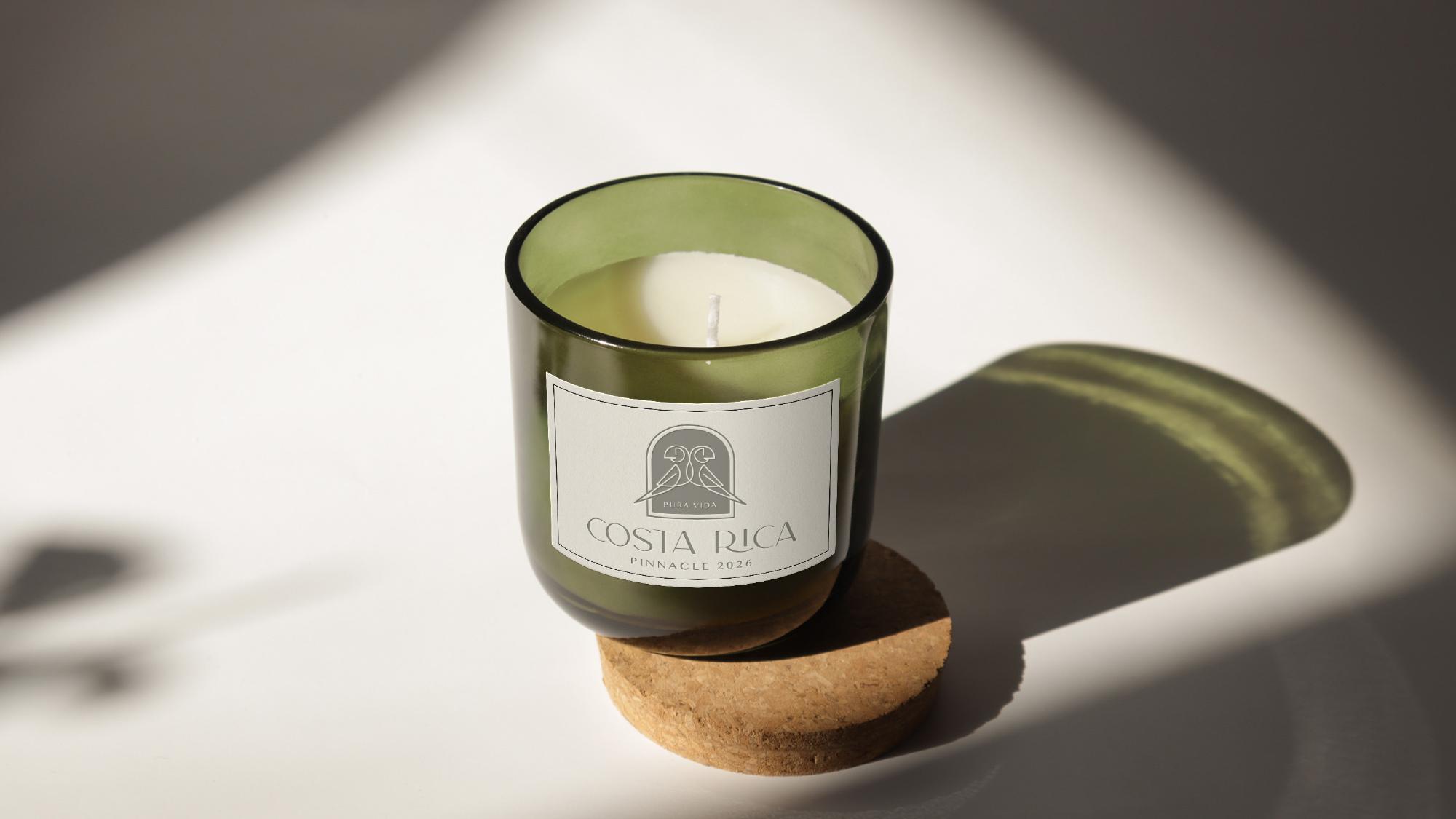
To help the client imagine the chosen identity in context, a small set of mockups was produced. These included items that would be part of the trip experience: embroidered towels, a yoga mat for wellness activities, and an aromatic candle to echo the relaxed, sensorial mood of Costa Rica.
The mockups were intentionally simple — just enough to show how the mark would behave on physical and environmental surfaces without overproducing before the final logo was approved.
Outcome
The brand book succeeded as a decision-making tool. By keeping the presentation concise and visually driven, the team could compare the three directions side by side and select the one that best matched the trip's tone. The chosen logo would then become the foundation for a complete brand system.