The Brief
Caroline Von Jelita is a creative office working in interior design, where clients buy taste and trust long before they buy a floor plan. The brand needed an identity that felt like the interiors themselves: calm, considered, and unmistakably premium.
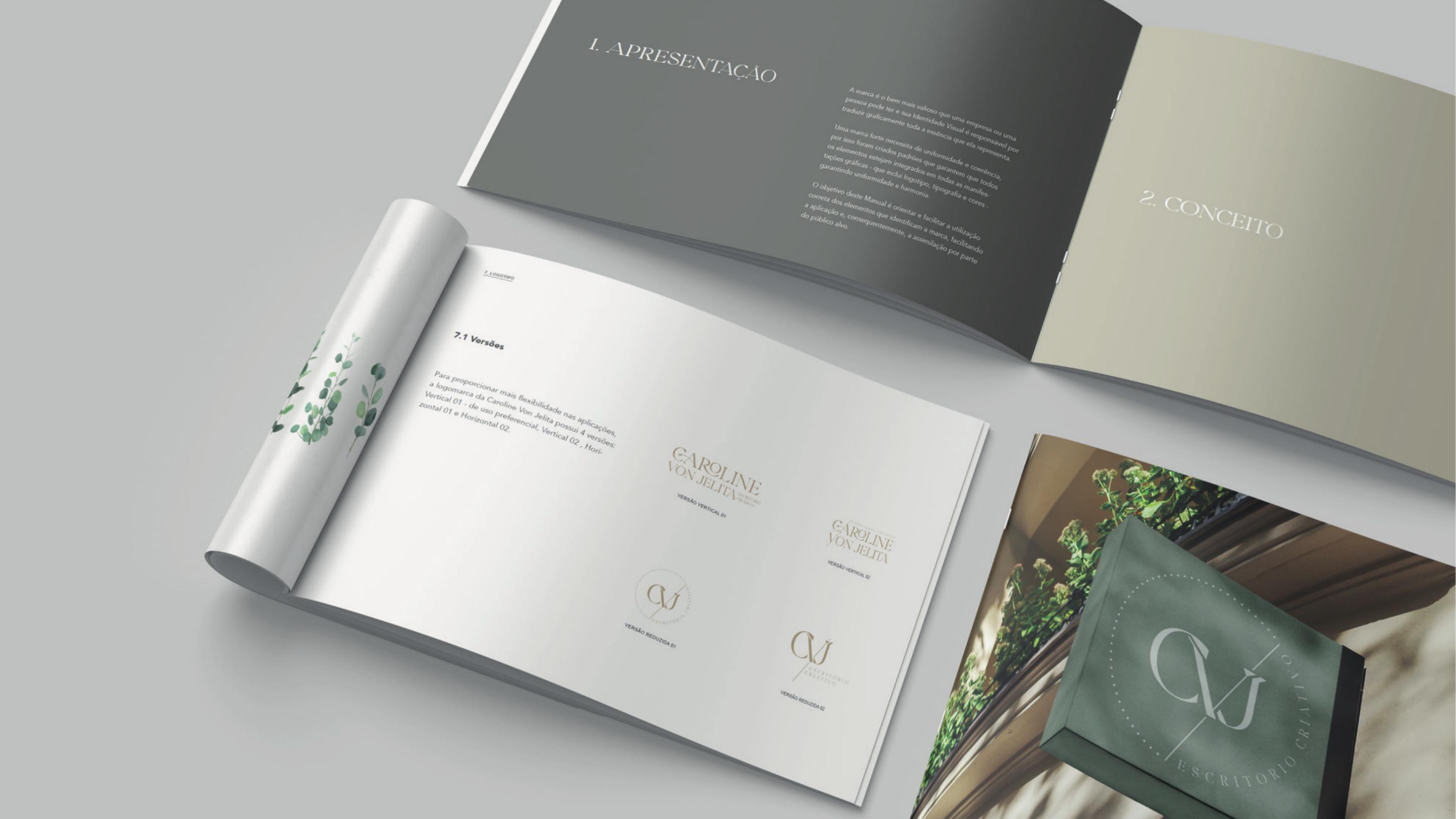
The deliverable was a brand manual, a document that sets the rules so every future application stays coherent. It defines the concept, the logo versions, the typography and the exact color specifications for print and screen.
Concept & Personality
The starting point was Caroline's own way of working: soft materials, natural light, and compositions that never shout. The identity translates that into a mark with generous white space, thin strokes and a slightly classical structure, closer to a signature than to a corporate logo.
A brand only reads as premium when it is consistent, so the manual opens by framing the identity as an asset to be protected. Uniformity across logo, typography and color is what allows a small studio to feel established.
Logo System
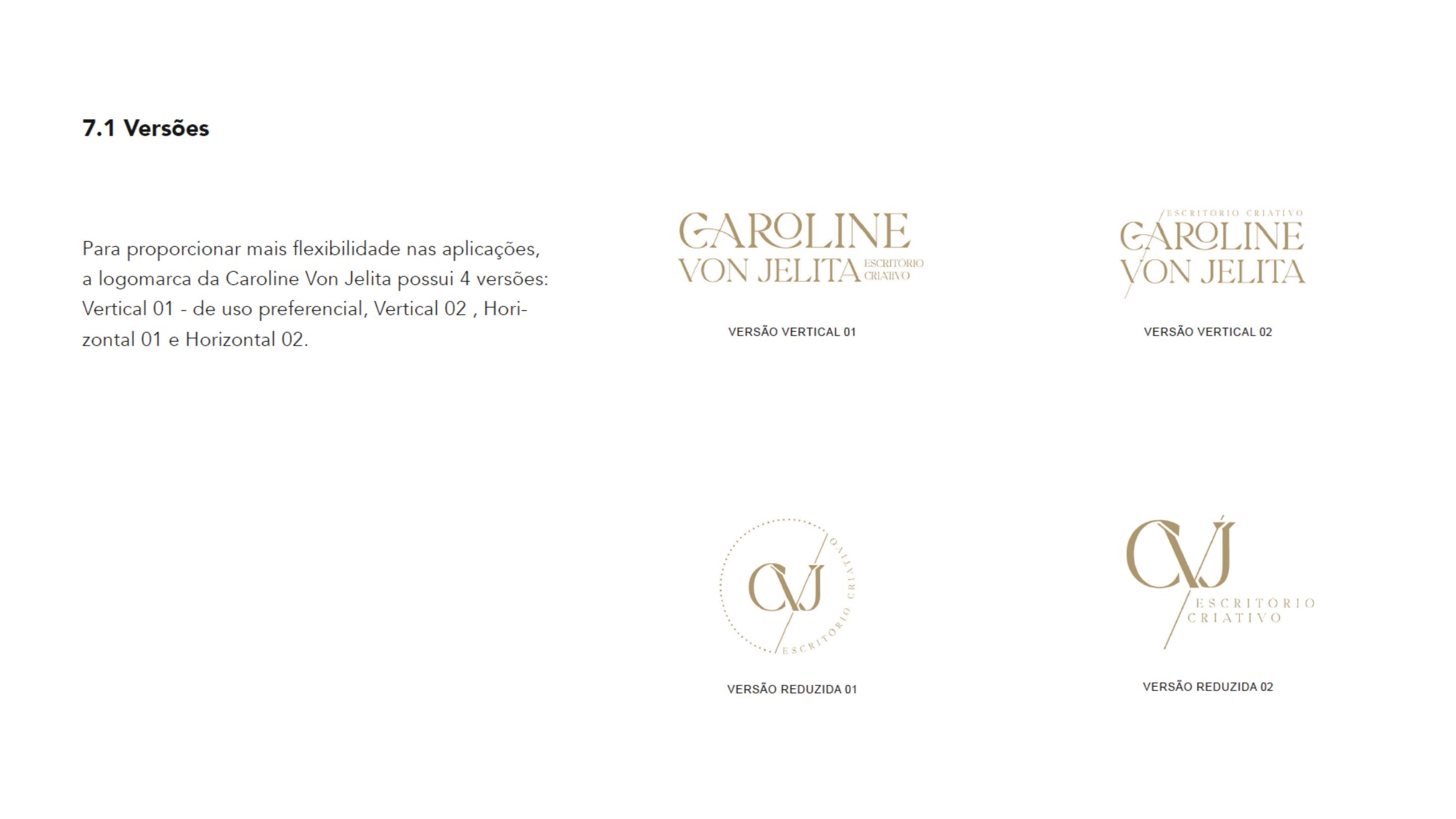
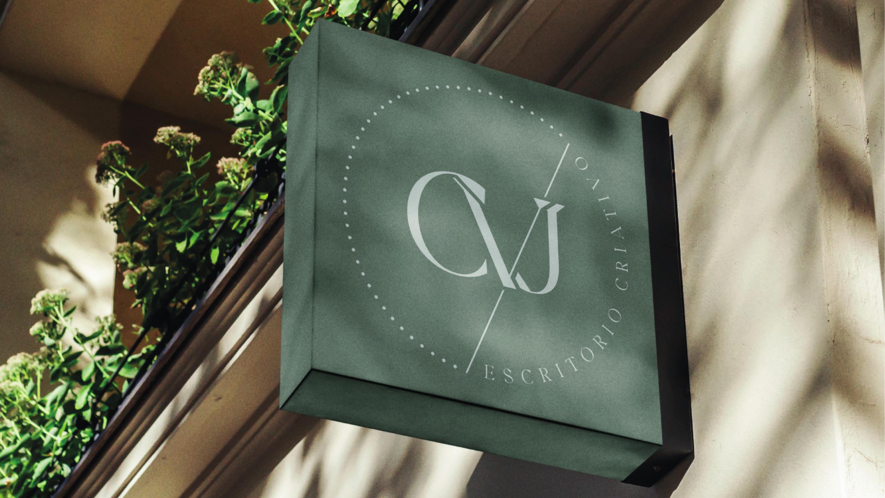
Four versions were built to give the studio flexibility without ever improvising: two vertical lockups, with Vertical 01 as the preferred use, plus two reduced marks based on the CVJ monogram for small or intimate applications.
The serif letterforms carry the premium positioning. High contrast between thick and thin strokes, elongated proportions and wide letter spacing on the 'escritório criativo' descriptor give the mark an editorial, almost couture quality, while the monogram works as a seal for stamps, wax and labels.
Color Palette
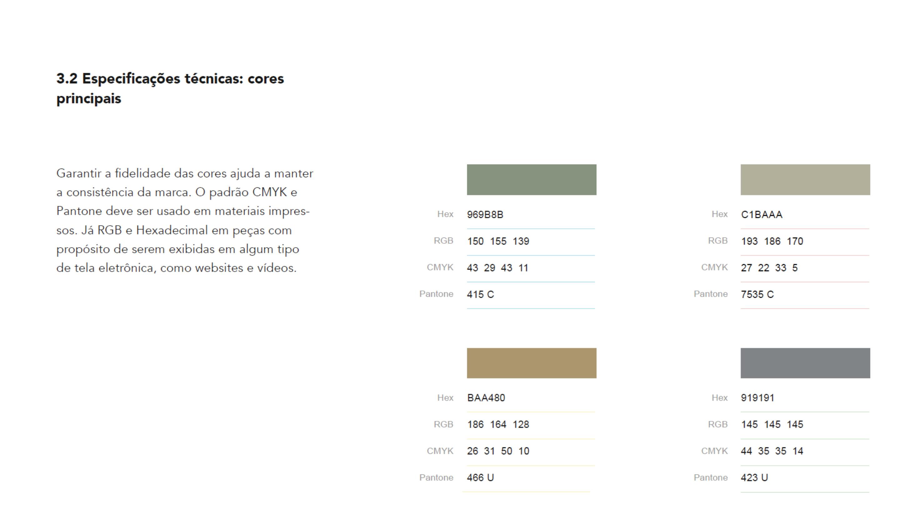
The palette avoids anything saturated. Sage green (#969B8B) anchors the identity with a botanical, grounded calm that echoes plants and natural stone. Warm greige (#C1BAAA) works as the breathing space, the neutral wall behind every composition.
Muted gold (#BAA480) is the premium accent, used sparingly for foil, seals and details, so luxury is suggested through material rather than color intensity. A neutral gray (#919191) completes the system for typography and technical information.
Each color was specified in CMYK and Pantone for print and in RGB and hexadecimal for screen, keeping the same mood across a business card, a candle label or a website.
Brand Applications
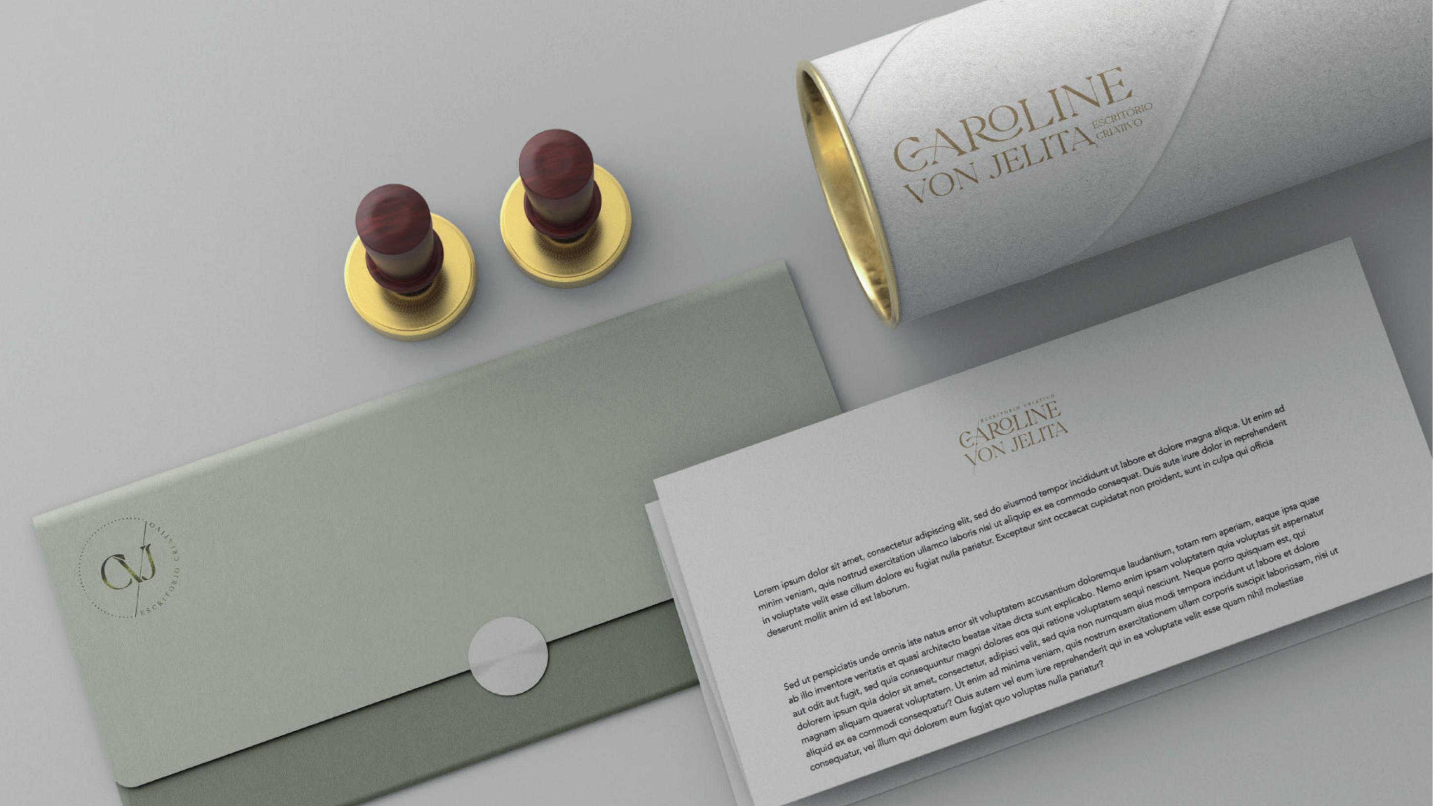
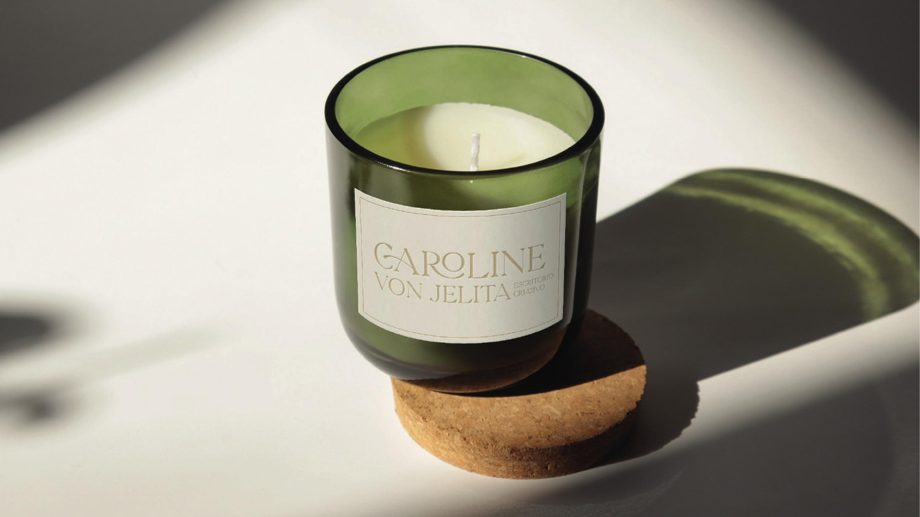
The applications were chosen to feel like gifts rather than marketing: a sage envelope closed with a wax seal, a mailing tube for drawings, letterhead in soft neutral stock, floral packaging and an aromatic candle carrying the horizontal lockup.
These are the moments where an interior design client actually touches the brand, so texture, uncoated paper and metallic detailing do most of the work. The identity stays quiet and lets the material speak.

Outcome
The result is a compact, disciplined manual that gives a small studio the confidence of a mature brand. With the logo versions, palette and typography fixed, every new piece can be produced quickly without diluting the premium positioning the identity was built to communicate.