Concept
Bravus sells replacement parts for trucks, so the identity had to look as strong as the market it wants to lead. The concept translates that ambition directly: every decision in the mark exists to communicate force, presence and reliability.
The typography carries that message first. Built on heavy, black-weight geometric letterforms, the logotype has the density of machined metal and reads with authority even at small sizes.
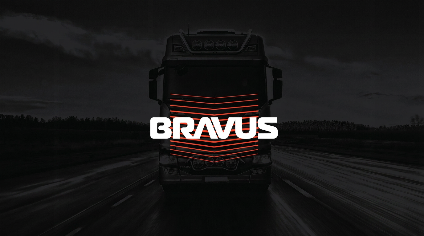
The horizontal lines are the second layer of the concept. Stacked and angled, they reproduce the front grille of a truck seen head-on, anchoring the brand in the product it serves. They also work as a movement graphic: they suggest that Bravus delivers exactly what keeps a fleet in constant motion, from point A to point B, without interruption.
Colors & Typography
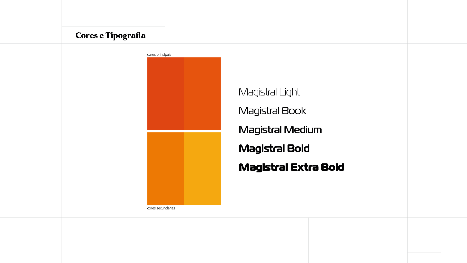
The primary palette is built on two reds, chosen for urgency, energy and immediate visibility on the road and on the shelf. The secondary range extends into orange and amber, giving warmth and hierarchy to secondary information without ever competing with the logo.
Typography is Magistral Bold. Its extended, squared geometry and mechanical joints echo automotive lettering, while the heavy weight delivers the strength the concept asks for. Lighter cuts of the same family handle technical copy and specifications, keeping the whole system inside one voice.
Responsive Logo
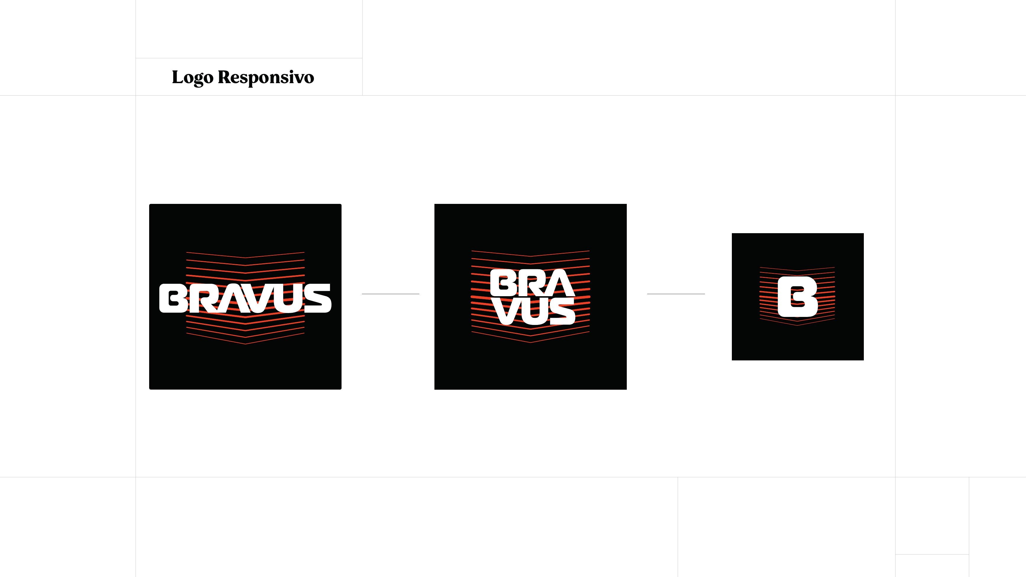
Instead of a single lockup, Bravus received a responsive logo system: three levels of complexity, each designed for a specific weight in the composition.
The most complex version is the one that tells the company's story and develops the concept in full. It is applied wherever the brand is the heaviest element of the piece, media and materials that give it room to lead.
The intermediate version keeps the same concept, graphically synthesised into a stacked, compact form for applications that cannot carry that much complexity or visual weight.
The simplified version reduces the brand to the B monogram inside the grille lines. It works as a watermark and as an identification element in materials where the logo is the lightest element of the composition, but still necessary.
Guide
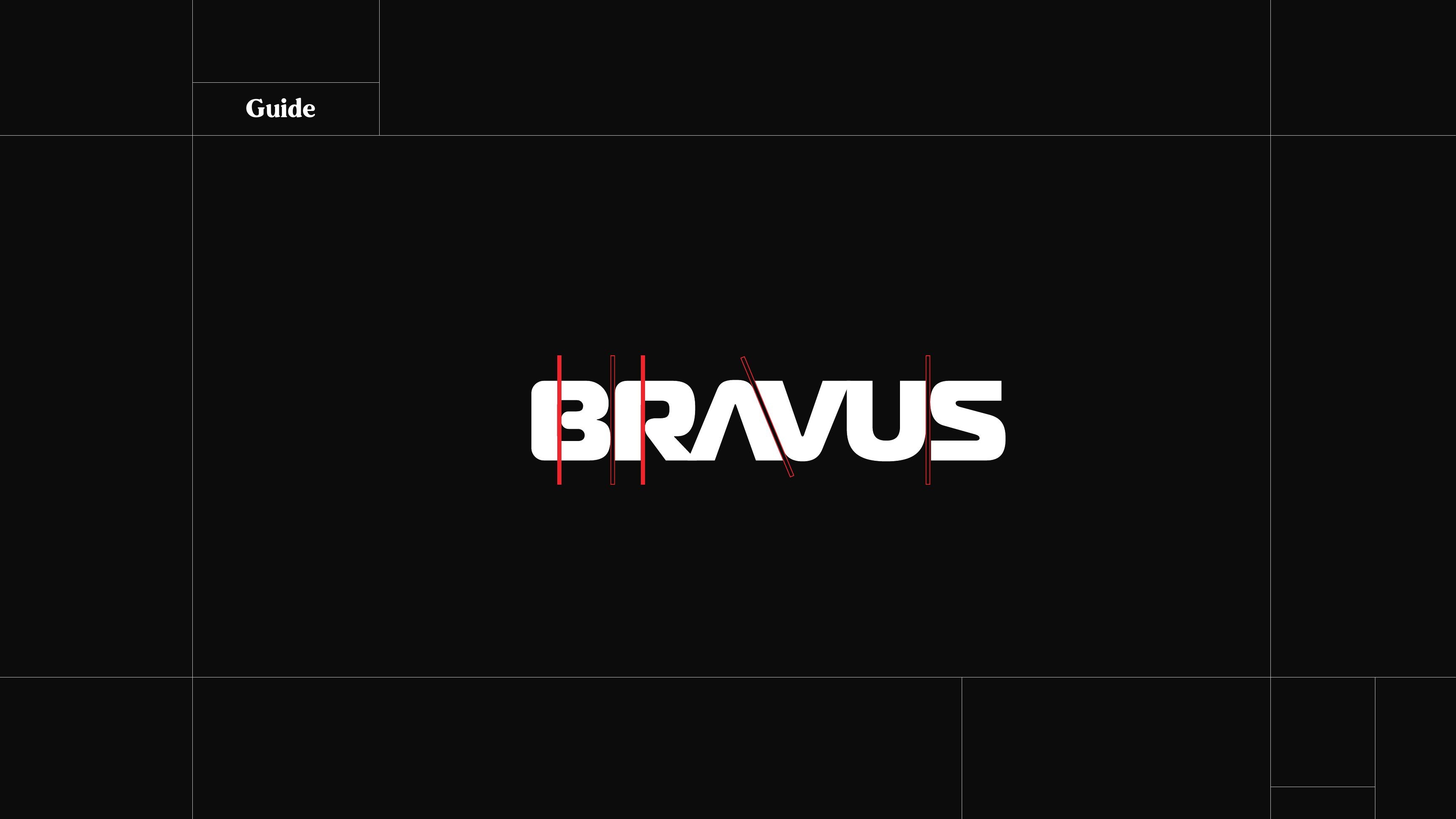
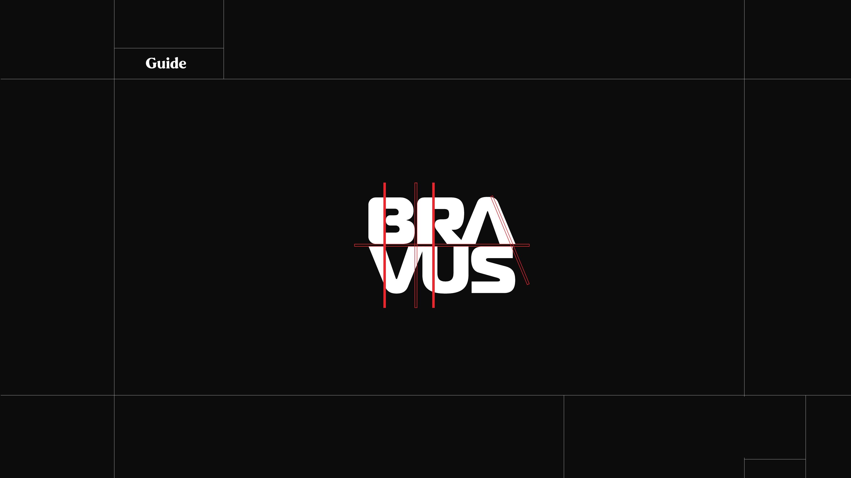
The construction guide fixes proportion, alignment and clear space for each version, so the mark keeps the same tension whether it is stamped on a box or printed at bus-stop scale.
It defines the approved geometry, the relationship between letterforms and grille graphic, and the minimum sizes for every level of the system.
Applications
We developed a set of brand applications across out-of-home, packaging and stationery.
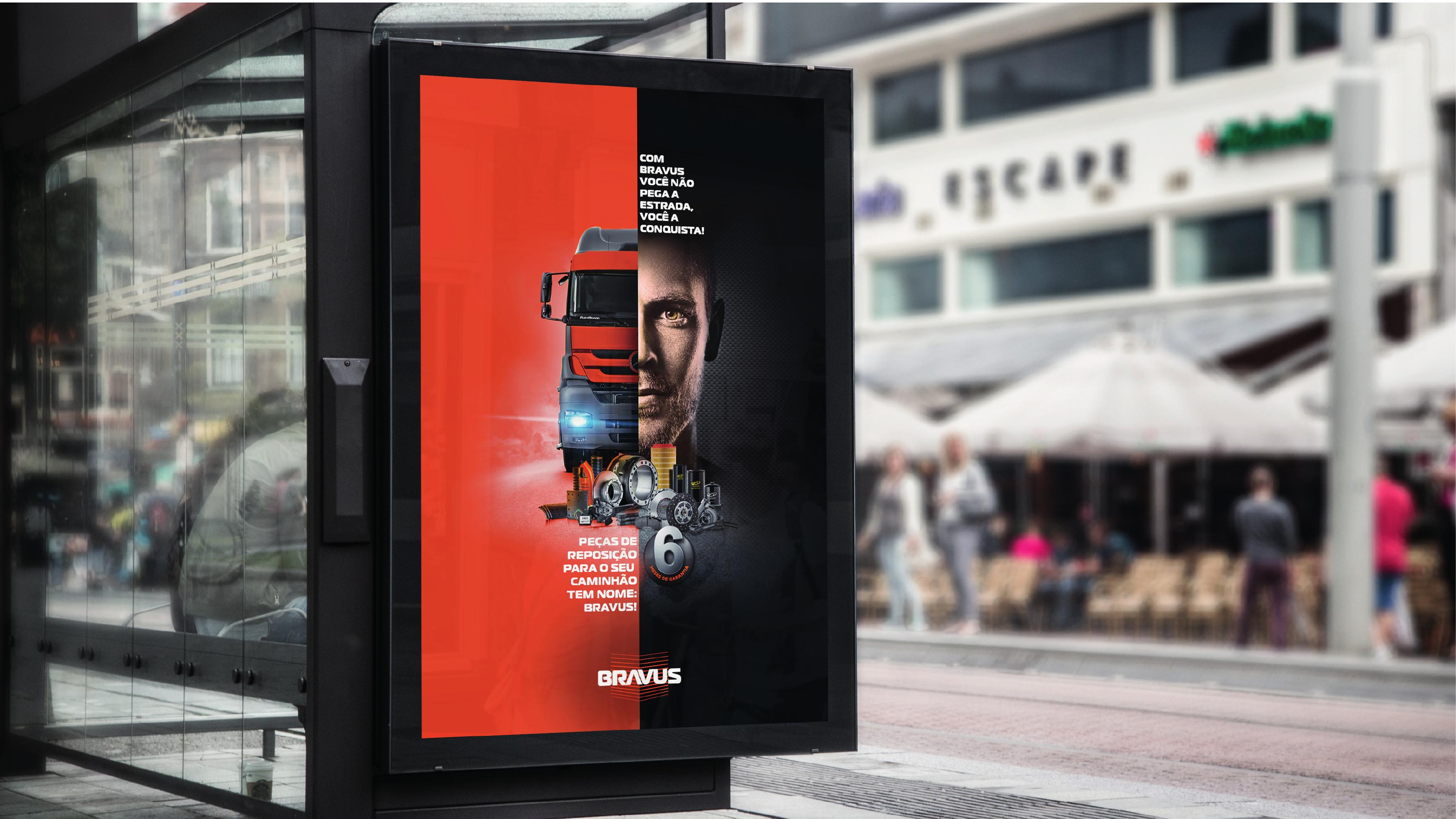
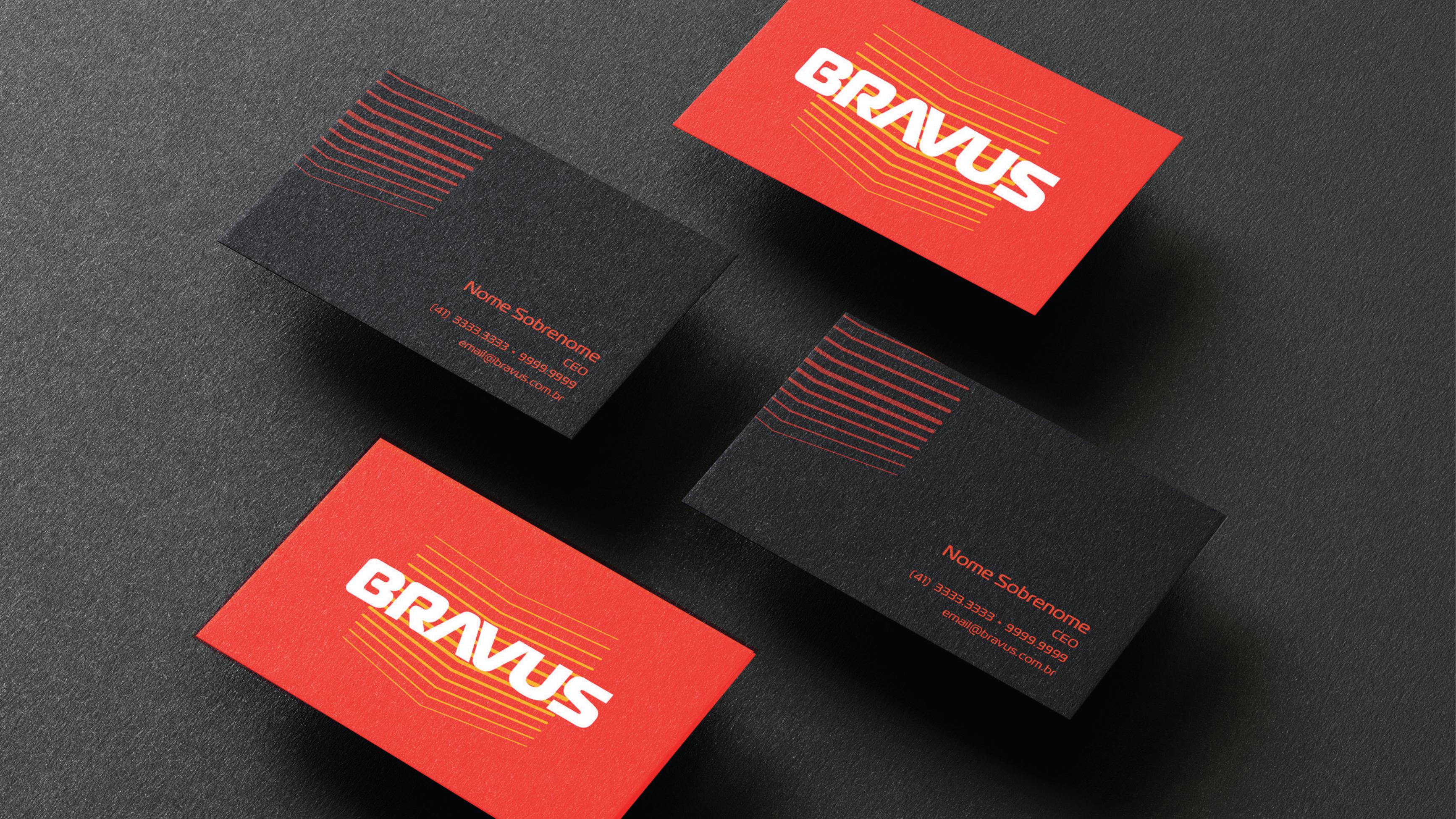
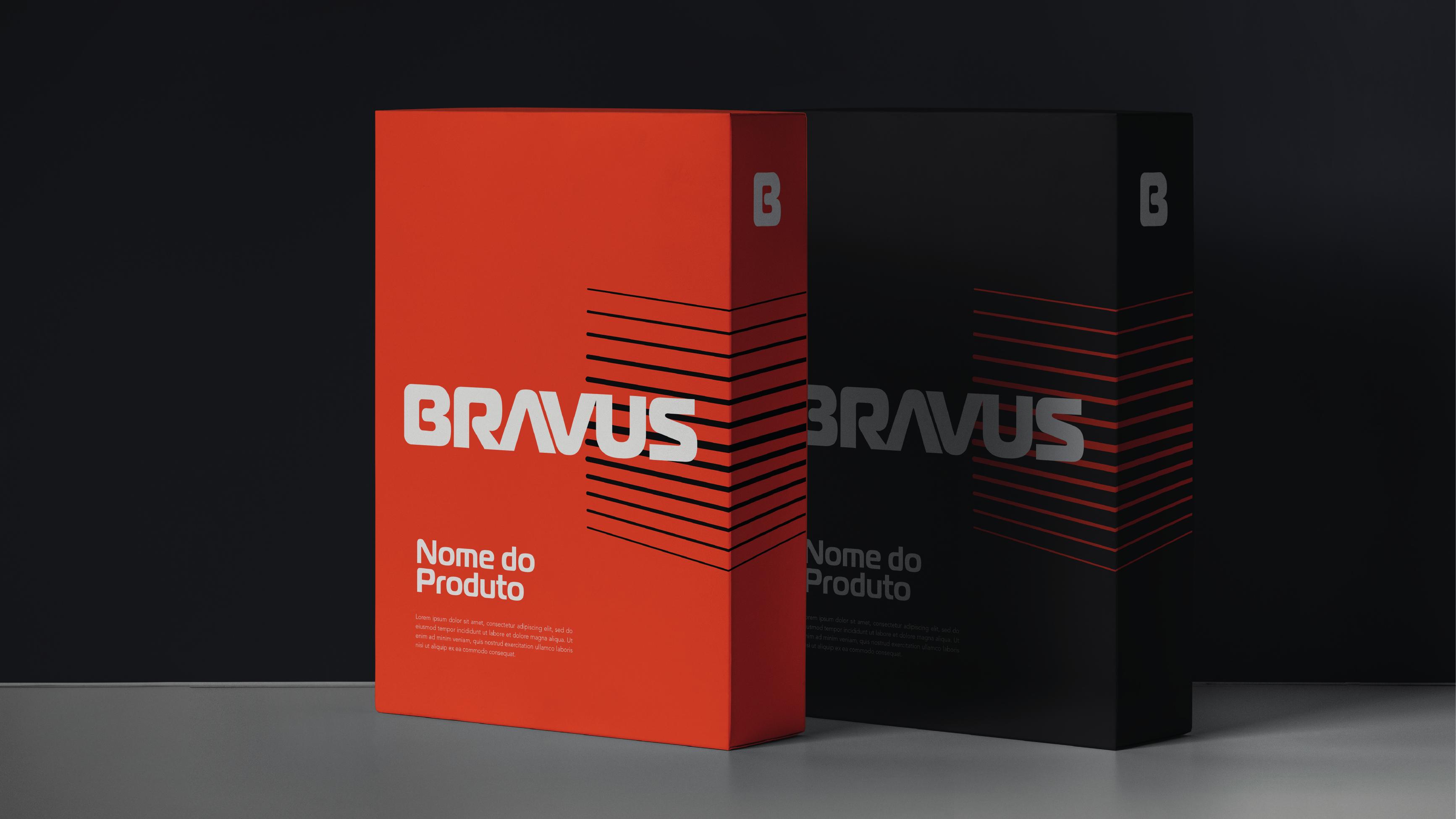
A bus stop campaign brings the full logo and the brand line into a large-format environment. Business cards explore both color moods of the palette, applying the red and graphite versions with the logo system. Product packaging uses the responsive lockups and the grille graphic to keep the identity consistent from shelf to delivery.